


Art Styles - Pixel Art
I know it's still in technical prototyping phase, but I'm poking around for art styles with my unnamed collaborator for the unnamed wire game.
Pixel art was my first thought, as it seems to be the standard these days for low-budget indie games. The first thing I always do in situations like this is to do some homework to see what's out there, so here we go:
Hyper Light Drifter
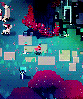
Isometric. Action RPG.
Emphasizes square (albeit irregular) blocky shapes in the environment. Solid colors for objects give clarity (especially the sword swings). Lots of fancy non-pixelated lighting effects and gradients. Unlike in some other games, there aren't lighting effects that focus on the main character; instead, the player is made distinctive by their red cape. The fact that the camera follows the main character keeps the focus on the player, but the player blends into their settings and appears to be part of the world.
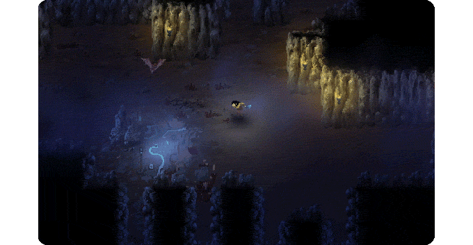
Eitr
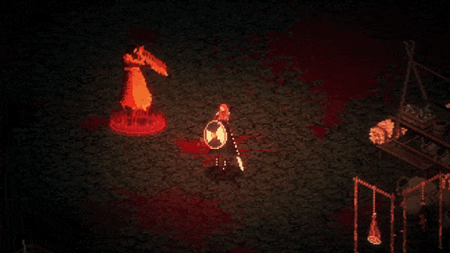
Isometric. Action RPG.
Makes heavy use of lighting effects, which especially stand out since the atmosphere of the game is darker than most. The solid-color sword swings are fast and minimal. Most of the screen is dark and lacks color variation, except for an illuminated circle around the main character. This creates a dark and unfamiliar environment to explore. It also focuses the attention heavily on the main character, creating the feeling of a lone hero who's different from the world around her.
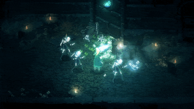
Children of Morta
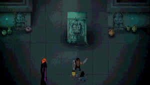
Isometric. Action RPG.
It's ALL about that animation, especially notable is the amount of work put into non-combat animations (which I assume will only play once in most cases!). We see the same solid-color characters and sword swings as in Hyperlight.
Crypt of the Necrodancer
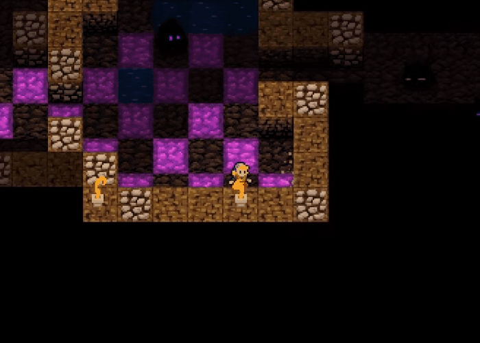
Isometric. Dungeon-crawling roguelike.Almost the opposite of Morta: since the game is tile-based, they get a lot of mileage out of simple animations. The step-by-step turns mean that they don't need to animate movements -- they just push the sprites in a quick arc. Many of the characters and enemies have their largest, most dramatic motion on the beat, which creates a screen-wide visual cue (even in the absence of the epileptic disco floor tiles) of the beat timing.
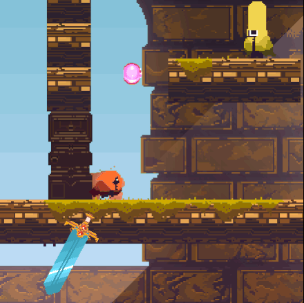
Swords and Sworcery EP
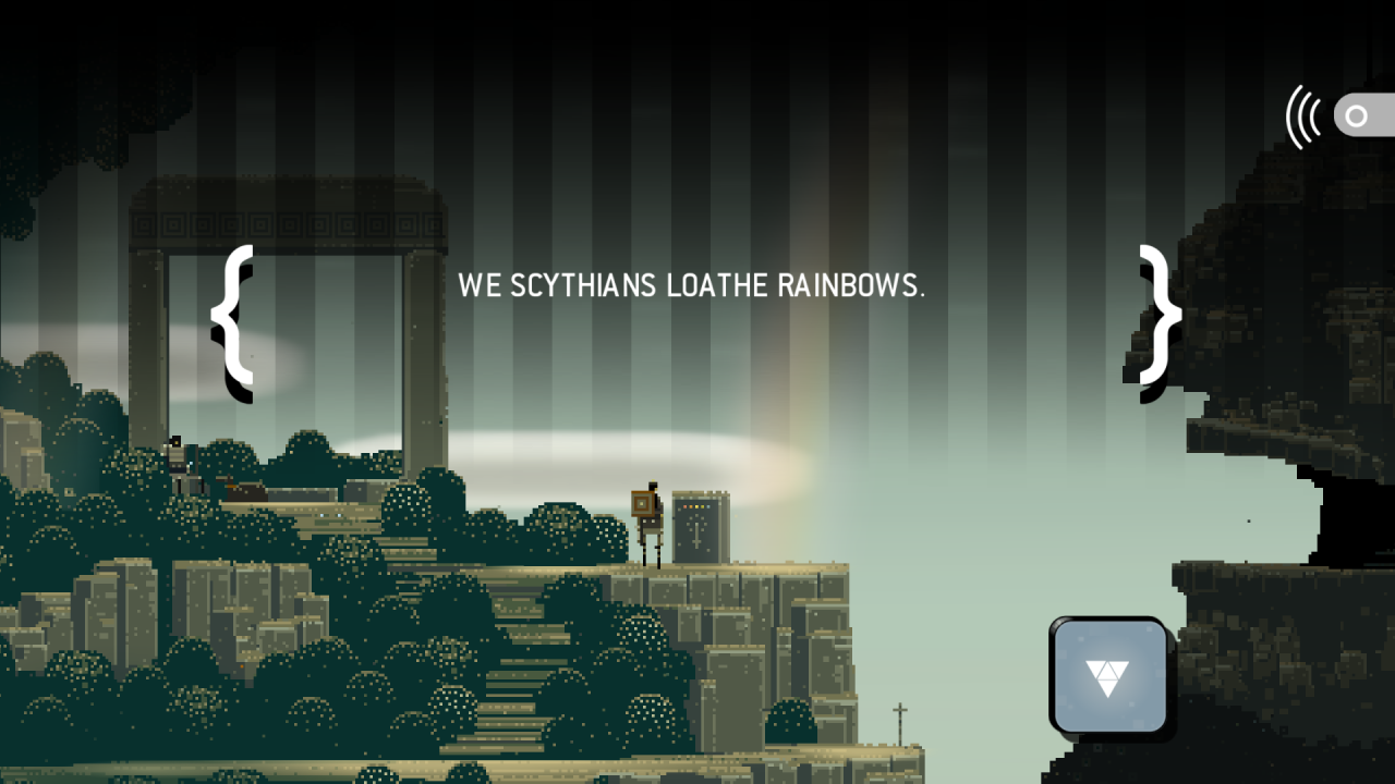
Side-view. Point-and-click adventure.
Emphasis on blocky shapes like in Hyperlight, but for characters rather than the environment. Incredible minimalism to the point of being abstract. Does a great job giving context for what a graphic "is" (e.g. square on your back is a shield since you have a sword).
The game shows a notable divergence from pixel art when displaying text, which is framed over a gradient that sits on top of the game world itself. This makes the reading sequences feel very removed from the game. My impression is that it creates a storybook-like feeling, where the decorations around the text serve to draw attention to the fact that you're playing through a story. The world in which you play in also allows for a very limited set of interactions with the player, reinforcing that a specific path that has been set out for the player.
(in-depth design post for the game that i found and thought was neat)
Fez
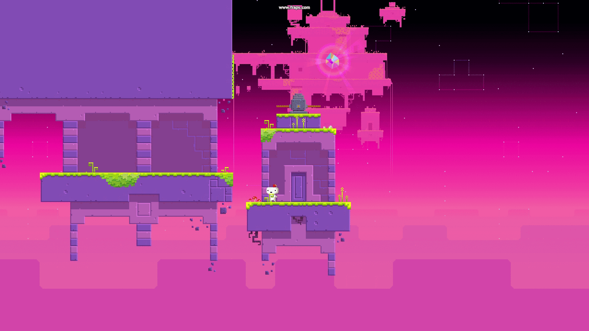

Side-view. Platformer.
Right angles, blocky environmental shapes again! Meshes well with the mechanics in this case: since they use somewhat non-intuitive 3D thinking, keeping everything in square voxels simplifies things.
Knytt / Knytt Stories
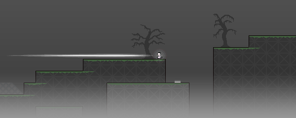
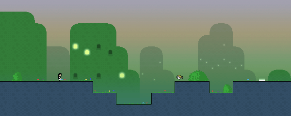
Side-view. Platformer.
Art isn't going to win any awards, but don't be fooled; it's not bad by any means. I'll take Knytt's stark clarity and consistency of style over sloppy photogenic art any day (I'm looking at you, Donkey Kong Country). Solid black pixel outlines are crude, but they clearly distinguish the ground from the background (as well as highlighting objects of interest). The lack of detail in the background graphics and lack of interactive objects give the world a feeling of expansiveness and even emptiness. Lighting effects are simple semi-transparent graphics animated by modulating the opacity.The gameplay consists almost exclusively of exploration, so the art doesn't have any bells or whistles that it doesn't need.
Doko Roko
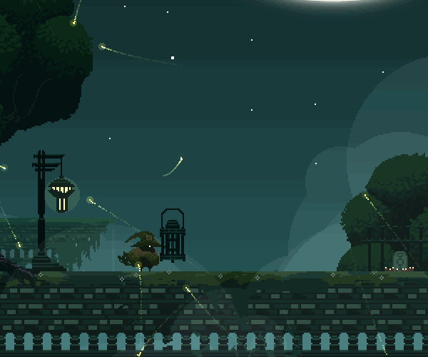
Side-view. Platformer.
What probably impresses me most about Doko Roko's art is that it has that gorgeous-modern-pixel-art feel of Hyperlight/Eitr/Morta/Megasphere but without any fancy lighting effects! If you look closely at even the magical firefly gif, it's just transparency + animation! It doesn't use anything fancier than what you see in Knytt.
Getting motion and effects through solid colors and animation rather than lighting effects gives the style a cleaness that I love. This also allows the viewer to appreciate details such as the movement of the fabric and smooth animation (as opposed to constant velocity motion or motion that happens in visible steps), which give the game a modern feeling to distinguish it from simpler pixel games as well.
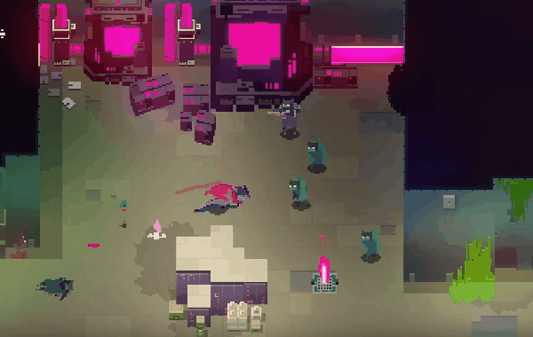
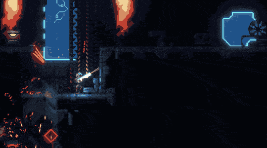
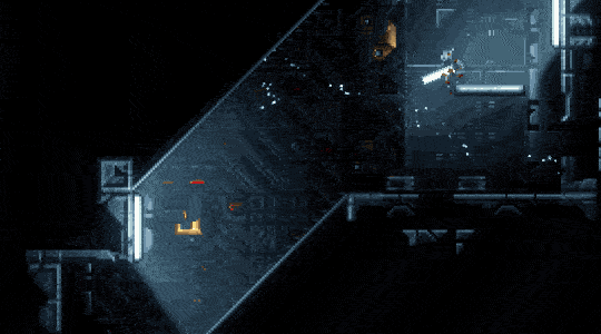
Megasphere
Side-view. Platformer.
Talk about lighting effects. All of the lighting seen here is generated by artificial, mechanical means, highlighting both interactive objects and points of interest. The fact that light rarely moves beyond the walls gives the game a slightly claustrophobic, maze-like setting. The thing that stands out most to me is the inclusion of geometric / pixel explosion effects. These stand in contrast to the shadow-filled, visually complex backgrounds.