Prebones build, UI stylekit, instant action
Big update this month, including a new public build (0.2.0) which early-access backers can download from Backerkit.
Let’s get into what’s new!
New UI stylekit
I feel a bit unsure about sharing this story, but I think it’s a valuable look into the navigation of team dynamics & artistic visions.
There’s been a long-running tension that has developed between Carpenter and myself about UI; I’d characterize our respective styles as me being attracted to esoteric, expressive designs with a lot of flourishes (see Witchdice) and he likes orderly, minimalist, and consistent layouts that give a lot of information. Respectively, each of these approaches have their own drawbacks: my approach produces UI with a steep learning curve and requires a high level of hand-crafting, while his can end up feeling generic and flavorless.
We entered into this knowing that UI design was an area where we were both skilled & had strong opinions. He’s in charge of design as art director and I’m the one doing the bulk of implementation (which requires a lot of improvisation), so we can’t clearly separate out the responsibility of who’s 100% “in charge” of UI.
Predictably, this led to a persistent feeling of dissatisfaction. I kept throwing little artistic tantrums like making the Catalog Ring system (shown later in this post), getting crises of faith, or adding loud solid-color areas that honestly didn’t fit in with the rest of the rest of the muted-blue UI. He suggested we could cordon off sections of the game where we could each set the style, which neither of us thought was really a good idea. The ideal solution in my eyes would be to develop a single style throughout that took both of our strengths and balanced out each other’s weaknesses.
The biggest reason I asked Carpenter to go in on making Lancer Tactics with me is because we were housemates through the early years of Covid. I have a battle-tested rock-solid trust in our ability to communicate. None of this felt like it would be a problem if we were still co-located! We just needed to be able to get more frequent spur-of-the-moment check ins about design!
So I flew down to San Fransisco for a week, and I’m pleased to say that it was a massive success. We spent three intensive days going through options, hashing out the experiences we wanted the game to support in various stages (“this is so cool” in-game and “this is going to be so cool” in-menu), arguing about colors, and roping in housemates for external mini A/B tests.
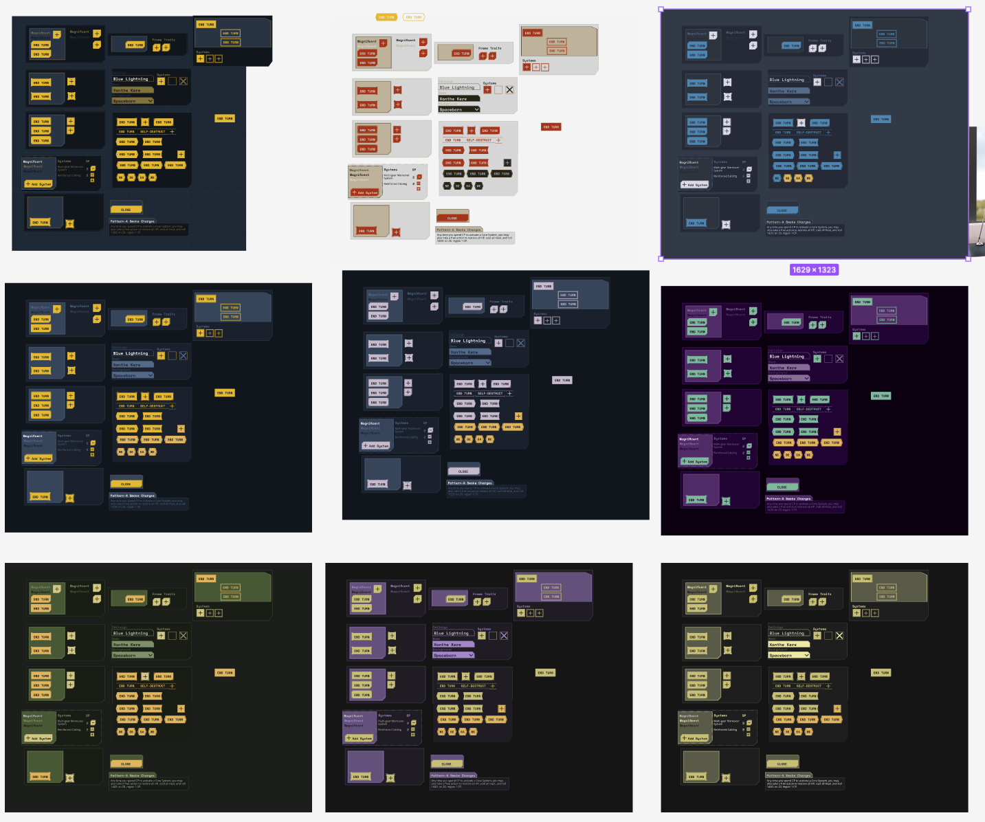
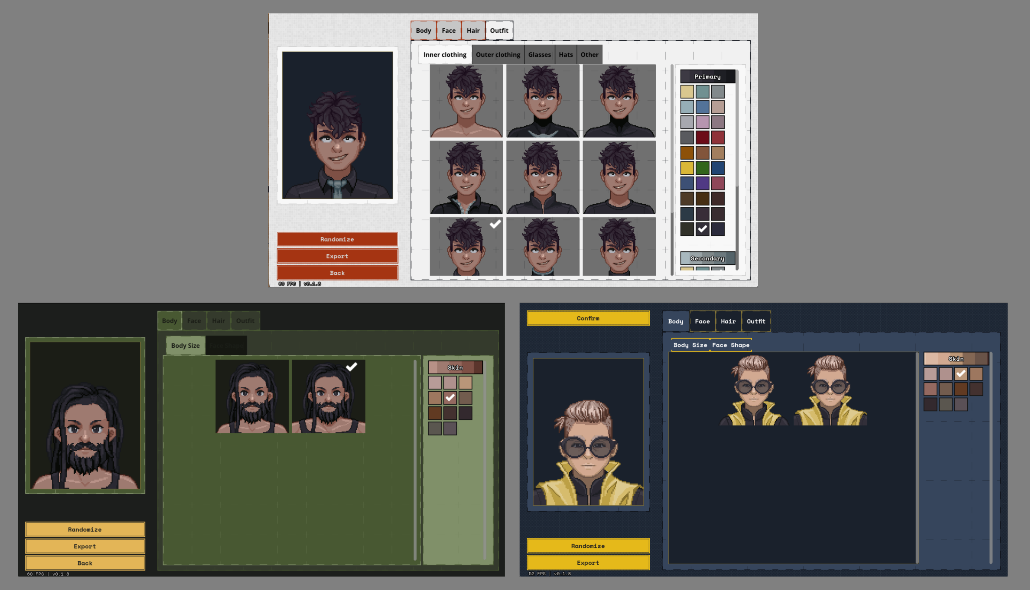
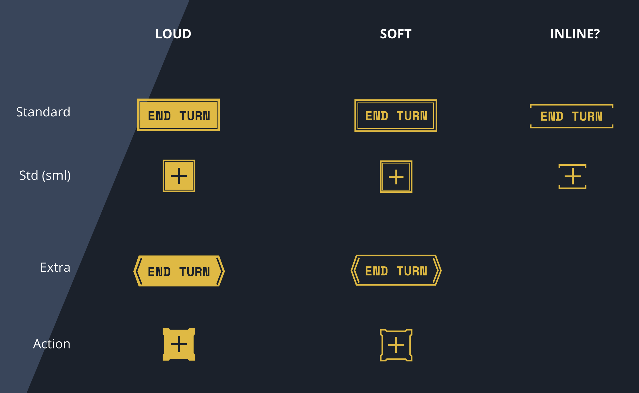
Our major areas of concern in developing a stylekit were:
- What are the colors? Hugely important for establishing a visual identity.
- What’s the style & amount of ornamentation? Too much and things feel cluttered, too little and it feels like showing up to a nice dinner in jeans and a tshirt.
- How diagetic should the UI be? Is it something that exists in-world or is it purely an artifact of the video game? We have a constraint that Lancer Tactics is designed to be used in settings besides Verdevilla so we couldn’t do something hyper-local to that planet.
I had a grudge in my heart against making a scifi game with a steel blue color scheme (it’s so cliche 🥲) but Carpenter’s cooler head prevailed and the addition of the bright yellow for clickable elements finally, grudgingly, won me over. I’m very happy to have this nailed down — it’ll make my job in wiring up menus a hundred times easier from here on out, and the game looks sick to boot.
We also finally decided that the “back” button would be consistently in the top-left of screens; an example of Carpenter’s ability to notice hitches when things were inconsistent and iron them out.
Instant Action screen
Getting a consistent & good-looking stylekit was an instant and massive power-up. It suddenly became very easy to put together screens that felt production-quality — a welcome change from the “well here’s a prototype, it’ll probably change” uncommitted feeling I had about most of the UI.
As such, we’ve finally gotten a real setup screen for playing matches! Carpenter designed this cool layout where the map slowly rotates in the center of the screen — it feels oddly nostalgic. It was feeling a bit sparse so I also made another stock map + implemented the Gauntlet sitrep to round things out.
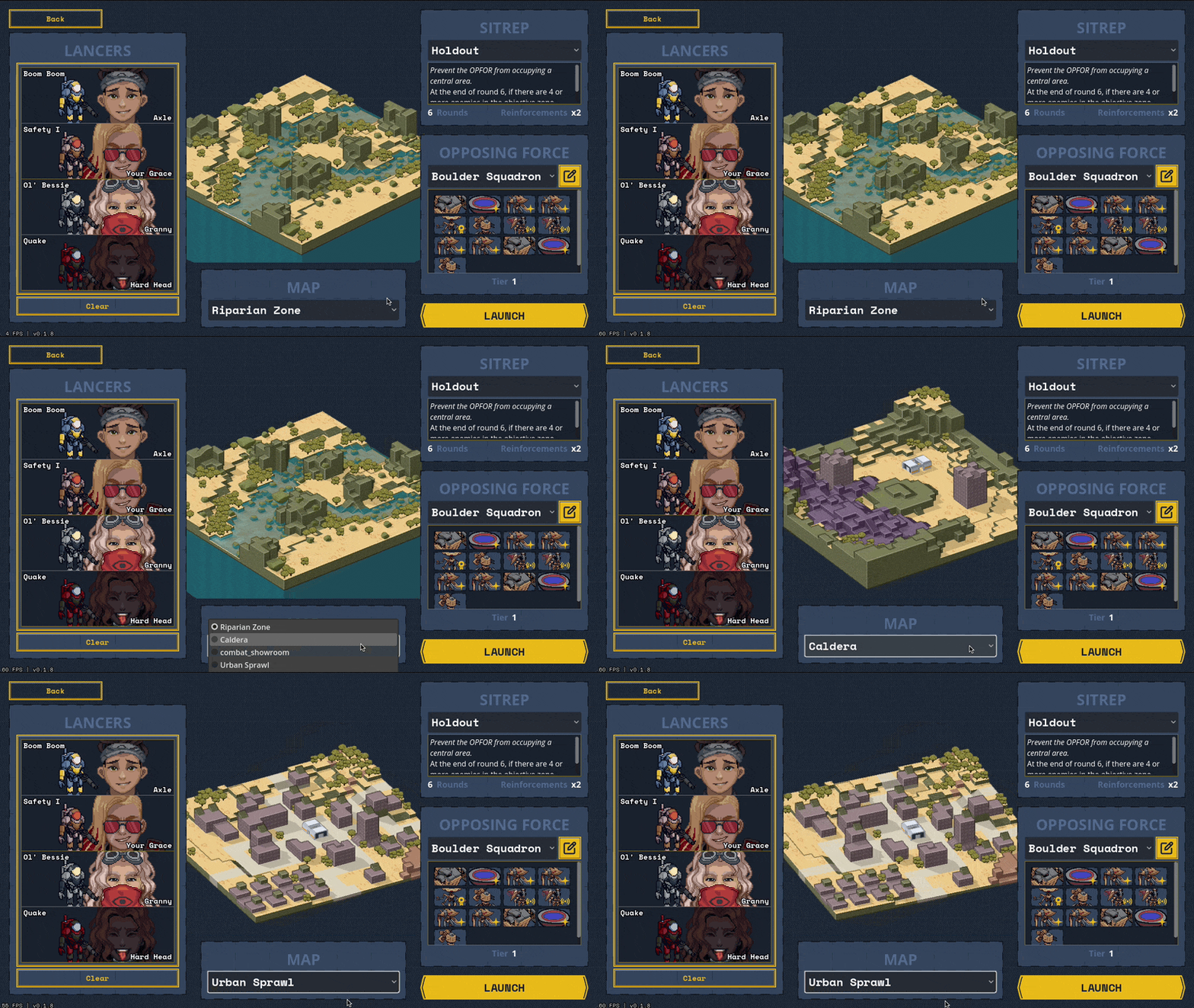
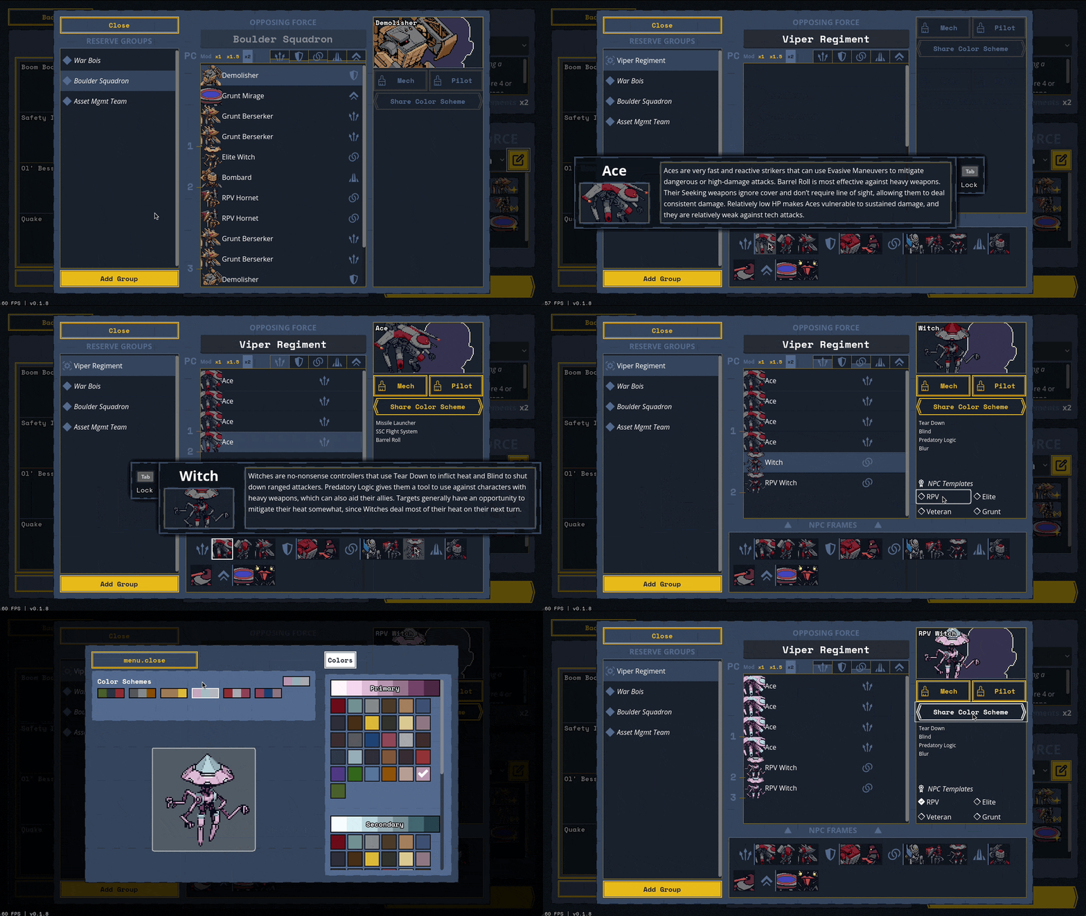
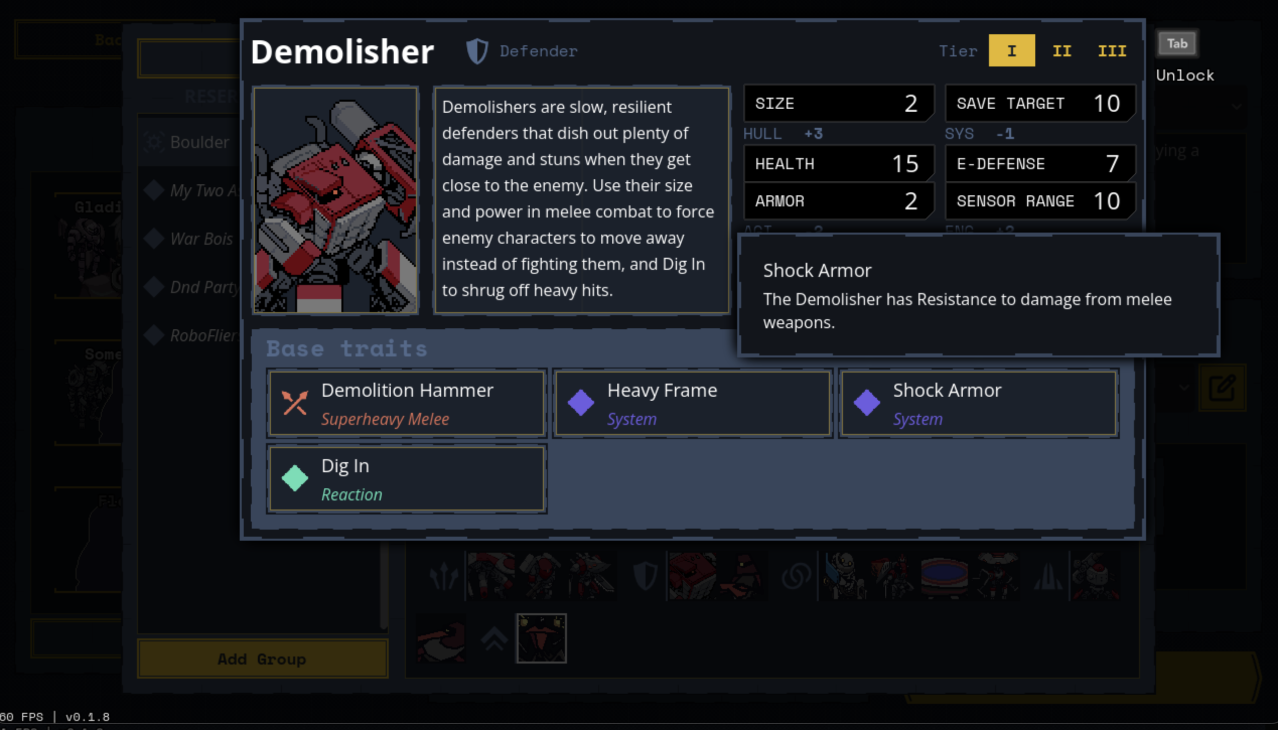
I feel like I say this a lot but there are so many menus in this game. Even with the stylekit, setting up the Opposing Force modal in particular took a better part of a week. I think about this comic almost every day as I’m wiring up the umteenth damn button or list or dropdown menu:
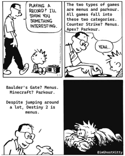
Well, if this is a Menus game, we might as well make menus the game!!
Pre-stylekit, to keep my eyes from falling out from looking at one more plain table of names and numbers, I threw together this juicy “catalog ring” to pick mech licenses, talents, and core bonuses.
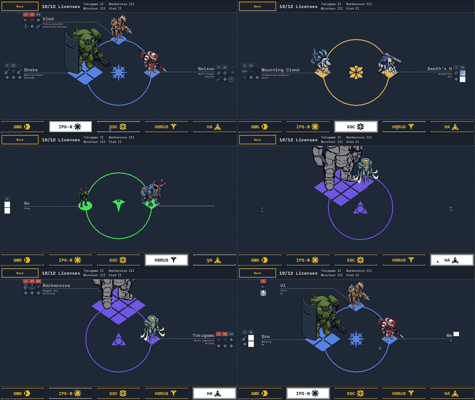
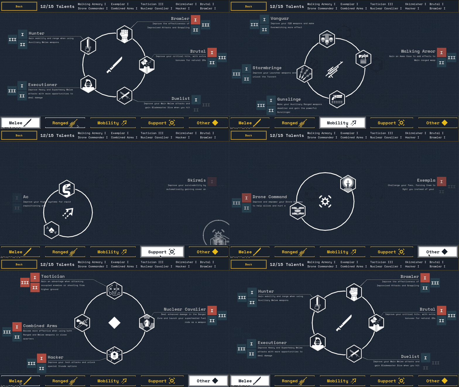
In playing with this, I noticed a few advantages it brings compared to a more basic list:
- This is a game about mechs! There’s a reason the core rulebook gives the art a full splashpage for each frame; a huge emotional strength of the genre is saying “wow cool robot”. This gives Gen’s art room to be spotlighted and be the star of the show for a screen.
- It breaks up the lists into categories. This could be accomplished with tabs… but information is easier to parse when it’s laid out spatially than in solid blocks of text. Infographics famously run the risk of being lightweight but have always been effective at giving the reader space to let their eyes form a relationship to the shape of the information.
- The experience of visual pleasure helps keep readers engaged! We are not information processing robots! Zoop zoop lights and sounds keeps human happy and relaxed, which defuses the fear of being presented with a complicated system you don’t understand.
As a touchstone, In Other Waters is my favorite touchstone of a game that goes hard into making the UI just as visually appealing and fun to play as a traditional game world.
New battle layout
I think about this screenshot in the original Kerbal Space Program fairly often. In what’s a sensible idea in the abstract, they put all the most important information (elevation, orientation, and your rocket) all in the center of the screen where it’d be most visible. However in doing so, these three elements end up competing and getting in each others’ way while other vast swathes of screen real estate are wasted rendering low-resolution empty space. The sequel pursued a more sensible & balanced layout, shuffling things around to leave an open view of the game world.
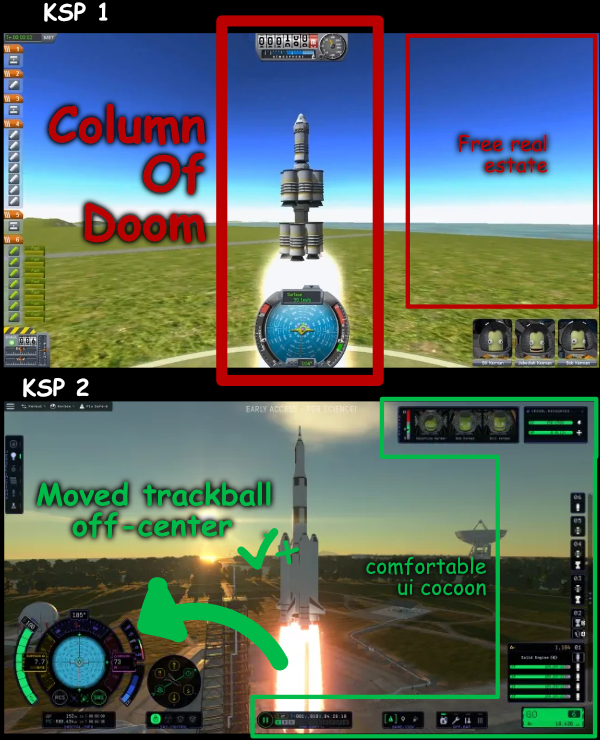
While less extreme, I noticed myself feeling claustrophobic in our battle UI. Meaty action tooltips would pop up from the bottom-center action bar and cover up the center of the screen.
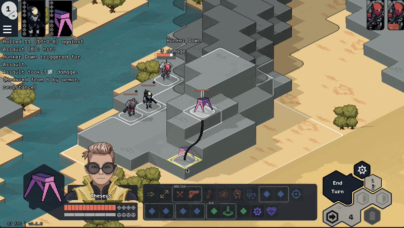
So as part of the UI overhaul, we sunk some time into improving the layout and opening up the center stage. The thought was to move the action bar off to the side to let the tooltips grow upwards into non-center space, and to anchor the elements more strongly to the corners to eliminate the semi-dead space there.
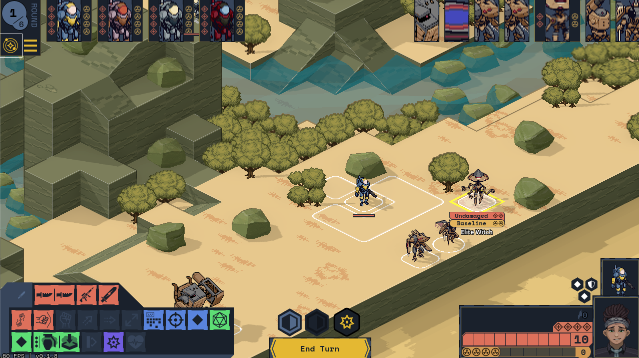
I’m not actually 100% convinced this was the right move, though? This new design accidentally puts too much emphasis on the “end turn” button, and having the action tooltips front-and-center might have actually been appropriate given how much time you spend looking through them. And unlike with KSP, you don’t need to be reading the UI while simultaneously watching the game world; it’s normal to flip between one and then the other. So there’s likely more work to be done here. Yay! :)
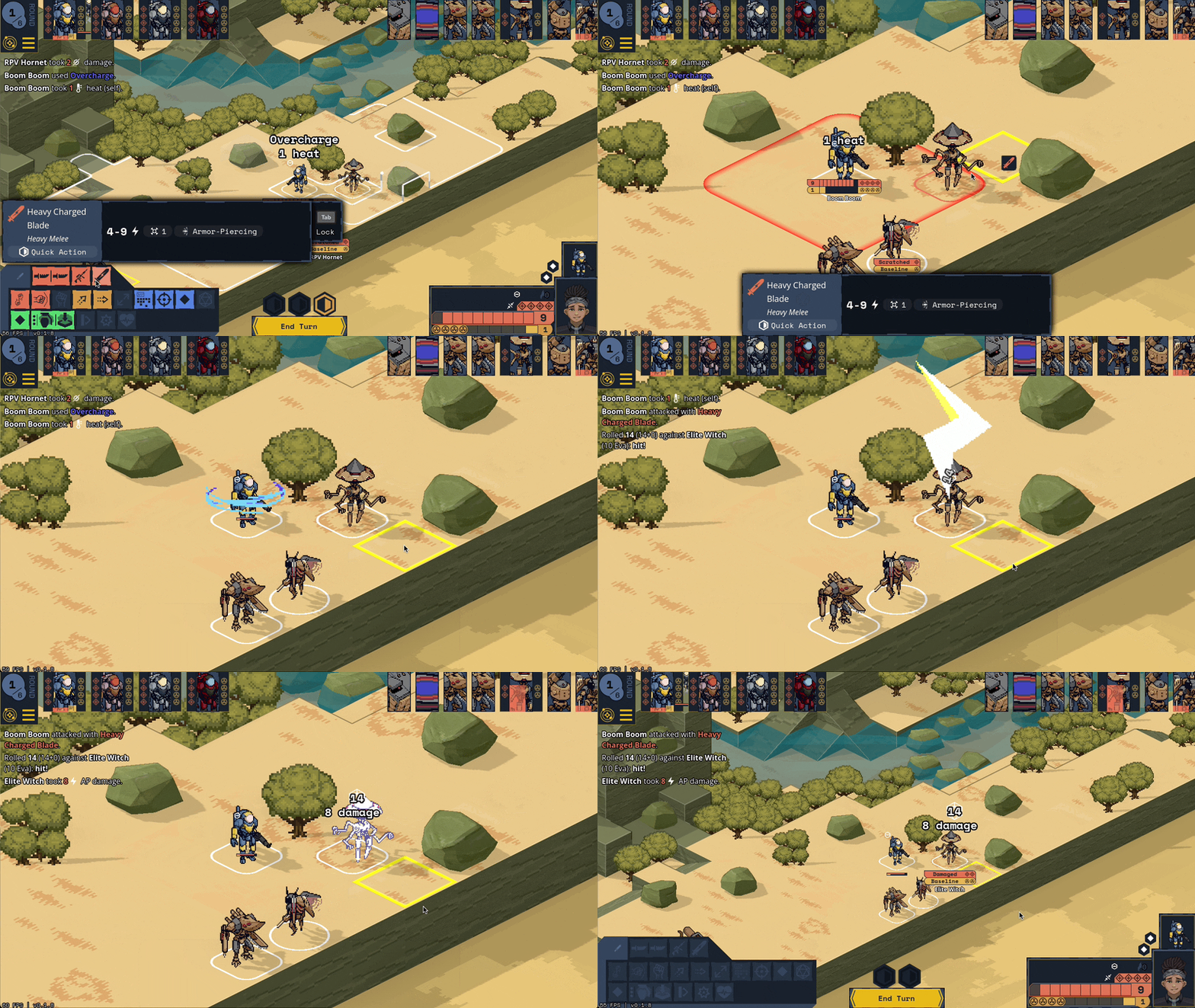
Also, the keen of eye will notice that the mini-healthbar under the Witch has unknown health/heat. We’ve implemented scanning; these values will be revealed as they’re used (in the case of gear) or when a neurotic player who was keeping track of everything would have gotten enough information to figure out what they were (e.g. structuring an NPC reveals what their max health is).
Telegraphing
Another major addition on the battle screen was NPC telegraphing; before this update, NPCs would just kind of do stuff and the game would roll on. If you were lucky you’d see what ability they used in the log or with a bit of popcorn text on the map. Now, when an NPC takes an action or reaction or has an important passive ability apply (e.g. Stampede Defense or Siege Armor), you’ll be shown a little informational window with a big “continue” button to let you know what’s going on.
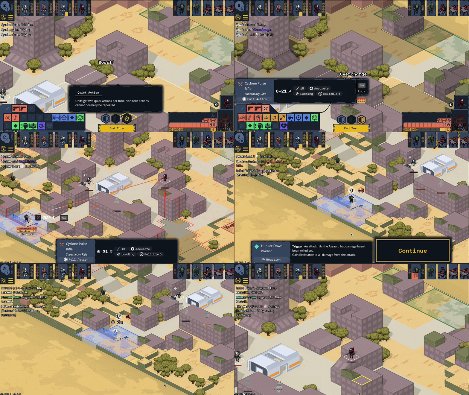
We’ll likely want to add a system for allowing players to permanently dismiss this telegraph window for specific abilities to help manage prompt spam, but for now we’re gonna opt on the side of being too verbose.
Content update
Last post, I talked about how well the push for making PC content went. I’m pleased to report that NPC frames and abilities has been going similarly well; I was able to get the rest of the “bones” NPC mechanics implemented! All the base traits (no optionals) are ingame for the Ace, Archer, Assault, Berserker, Bombard, Demolisher, Hornet, Mirage, Priest, Sentinel, Sniper, and Witch. The Mirage was by far the trickiest; it has to be able to figure out which of its allies wants to go where and undertake some pretty complicated actions to shuffle them around.
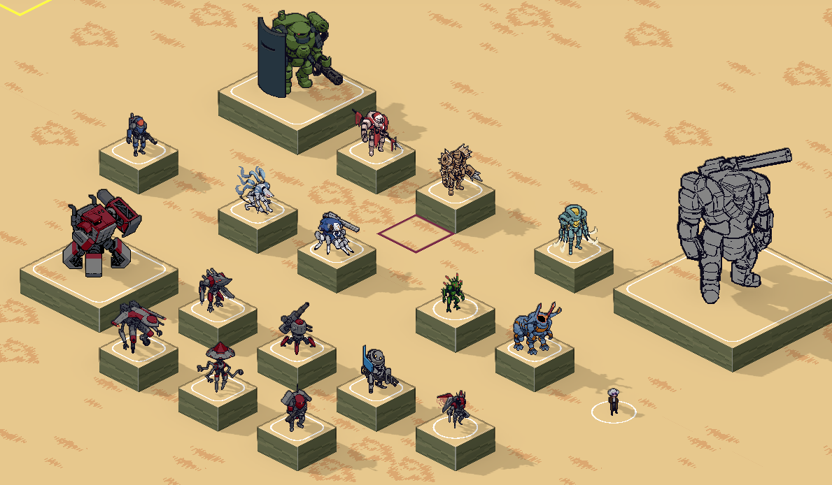
That brings us to a total of 10 / 29 PC mechs totally implemented, 15 / 29 talents done, and 12 / 30 NPC mechs with base systems. Gen has also continued to make sick as hell sprites for the mechs:
I’m also very excited to announce that we’ve brought on Connor Bridson to start making 3D assets for the map and abilities. Here’s a very fresh-off-the-presses first set of custom setpieces we’ve gotten ingame. It’s gonna be so great to start filling out the maps with props tailor-made for our game’s style.

Bugfixing & smaller additions:
- Added “Blinded” as a legit status.
- Being blinded is no longer counts as breaking line of sight when deciding whether a unit can hide.
- Rxn attacks on your turn no longer count against the repeat-actions soft limit.
- Declining to fire a followup aux on a mount now still counts against the repeat-actions soft limit.
- Mechs take fall damage when losing flight due to gear destruction.
- Fall damage is negated when falling into water.
- Size 2 units can’t spawn halfway off the map anymore.
- Did a pass and made all PC systems unique. The book is inconsistent about this so we’re making it true by default.
- Fail more gracefully when failing to load a save game.
- Show what campaign you’re editing while in the combat editor.
- Swapped out our FMOD Godot addon for one that’s more actively maintained.
- Wrote up some internal documentation for how ability FX are structured, in preparation for filling them out past placeholders.
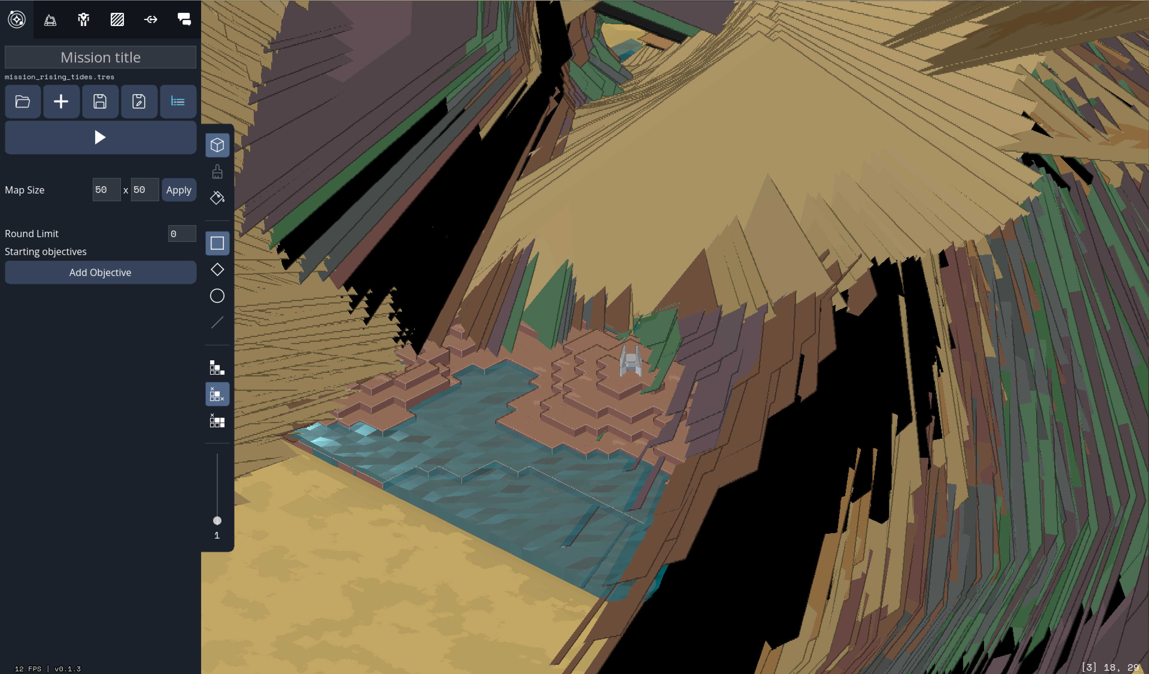
- Fixed “cursed map” graphical glitch that happened when there were enough solid voxels that the multimesh had to increase its pool size mid-render.
- Fixed a 8 ms/frame “is the mouse over UI” check. 😱
- Discourage Bombard from shelling itself.
- Demolishers no longer dig in against melee weapons (they have shock armor).
- AI avoids walking into dangerous terrain.
- AI doesn’t double up on a single zone as much if there are alternatives.
- Encourage AI to focus-fire exposed targets a bit.
- Add mandatory movement boolean for glitch sensors & barrel roll.
- Slowed condition disables movement reactions/systems by default.
- Gaining flying while underwater correctly removes the Slowed you had.
- During unit movement, camera jumps straight to destination instead of following for each step.
- Bigger popcorn text.
- Diceroll popcorn animation.
- Correctly unequip weapon mods when unequipping a weapon.
- Correctly unequip systems when we no longer have the system points for it.
- Fix Berserker Aggression targeting non-characters.
- Much better camera focus on flying / multiple units. Fixed calculation of how tall units make tiles.
- Prevent targeting biologicals with tech
- Thrown weapons are deployed to the map on both hits and misses.
- Targeting a deployable with AOE does not cause the bonus damage to be halved.
- Fixed some bugs in the calculation and reporting of bonus damage for single-target bonus damage sources.
- Gave standard ground block 4 armor. It was too fragile otherwise.
- Added default color schemes for all player mechs.
- More informative on-map healthbars under units.
I’m going to be taking a vacation at a friend’s place in New Zealand for most of January, so barring some critical bugfix to the build, the next update will likely be sometime in February.
I hope you enjoy this most recent build of the game! This is the first one where I feel like I could hand it to someone and be like “here, play instant action, that’s a Video Game experience.”
That’s all for this month. Happy holidays!
— Olive


