Wicklog 26: educational grant submission!
Grant!
Woof, the last wicklog was in January? I really let these slip. However! I have been writing. A lot. Out of the avenues for getting funding, I think that grant-writing is the best choice for CL. Grants are hefty, don't come with many strings, and usually have for-public-good goals that line up well with CL's educational aspects.
I wrote a grant about a year ago to get a sense of the process. As expected, I didn't get it. They told me that they loved the idea, but I needed a business plan. Which was fair —I didn't really have a plan beyond "I dunno, sell it to people, I guess?".
So I've spent the intervening year talking with folks working in edu games get a sense of what works business-wise (and to make friends!). Cold-calling, setting up meetings, and going to socials was NOT AN EASY THING for me, an introvert who once bussed across town for a meetup, saw that it was in a ~bar~, and got so scared that I turned around and got on the bus going back. Emailing a handful of people to ask for something is usually a full day's work for me.
So I'm hecka proud of myself and thankful to the folks I worked with, because we pulled all this together into a finished Grant Proposal #2: Operation: Get Crescent Loom Into Classrooms:
~ take a look! ~

(It was an SBIR application to the Department of Education, for reference)
These fifteen pages (plus a stack of supporting materials, e.g. budget) are a culmination of the last year's worth of work, including a business plan that I think will be able to thread the needle between profitability and making it available to low-resource organizations.
I think we have a solid shot, but these grants are very competitive (I think they select ~12 out of 500 applications). Even if they don't go for this one, I now have a good footing for future shots.
R&D
They'll let us know about the grant on June 20th, so I have a few months to do some free-form tooling around with the design. I want to 1) make it run faster so there can be more critters on the screen, and 2) experiment with different layouts to make the initial contact with the brain stuff more intuitive.
There's always a balance between what to simulate and what to simplify. I've taken the tactic of initially simulating as much as I could and then paring away what is unnecessary. I think simulated action potentials traveling down axons is now on that cutting block.
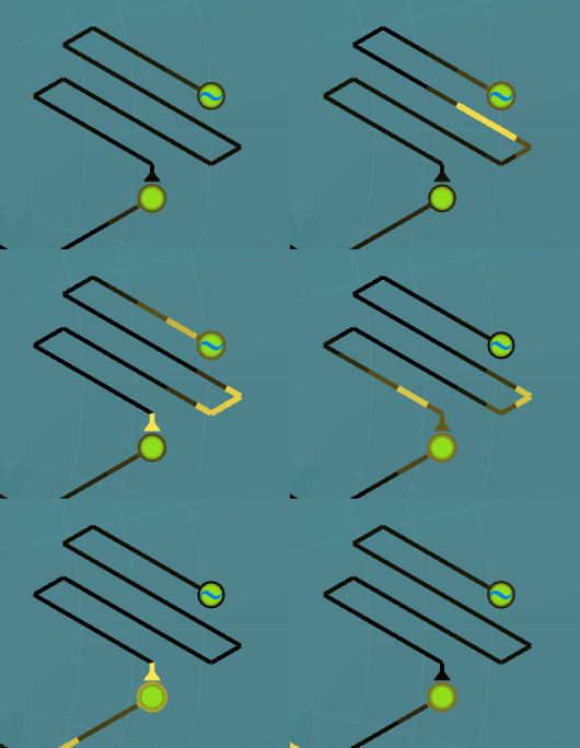
It used to be that you could see a pulse of activity travel along an axon, like so:

But setting up simulation values such that they worked for both the very-fast, very-large conductances of an action potential AND the slower dynamics of a cell body was difficult; it forced me to average things out so action potentials were slow enough that the simulation time-step could catch them. It also added a bunch of math overhead to calculated current flowing through these long wires.
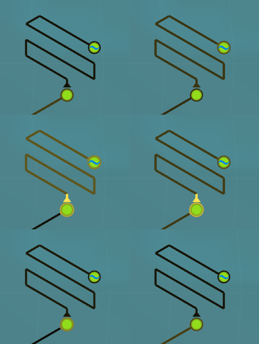
So I asked myself: what does simulating them add? I think it's really cool to be able to see the chain-reaction of a pulse going down the length of an axon, but functionally, is it worth it to do 20X more work to get "A activates B" to be a little more fancy? By treating it like a single unit, I cut out a ton of overhead and can get them to fire at slightly-more-realistic rates:

I have a few reservations:
I like how the original animation looked a LOT more.
-
There is an intuition that players have that pulses take longer to travel down longer connections, which is actually correct and is lost in this new simplification.
-
You won't be able to stimulate any part of an axon anymore and see a pulse travel outwards from that, which I thought was the coolest way to understand what axons were actually doing.
But I'm pretty sure I can cheat most of these back in with a more-simple hard-coded mechanisms. It's not as elegant, but pursuing structural elegance over usability is one of the deadly programmer sins.
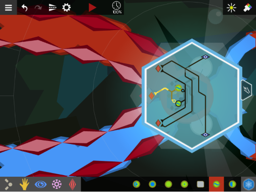
As far as different layouts go, I've never been happy with how separated the brain is from the body. It's a hold-over from the very earliest designs of the prototype, but I haven't found a better solution yet. But I would love it if instead of working on the brain floating off next to the creature, you could zoom into the creature and work there. Something like this:

There's a lot of challenges of this design (how do you see what's going on in both the creature and brain at the same time?), but I'll play around with it to see how it feels.
Timeline
I wanted to get a better picture of where I was in my process, so I made a timeline of CL's development thus far:

I'm a little surprised at how little time over the last two years I've actually spent working on it full-time. A bit after the kickstarter, a bit at Stugan, but wrangling with business stuff and writing and day jobbing has meant that it's been only a bit under 50%, overall. Hopefully getting more resources with the grant will help stabilize things?


