Wicklog #9 - Fancy graphics, avoiding invisible functionality, and game juiciness.
“I’ve added most of the systems,” I said to myself. “There’s not that much left to add to the basic engine, right? Make some objectives, polish the tutorial, iron out the physics bugs. It’s been about four months since the kickstarter, and I still have about four months left. This thing is in the bag!”
Oh, Wick of two weeks ago, you sweet summer child.
Based on feedback I got from the July 4th beta and juror feedback, the more-or-less unanimous response has been: “Great concept! I have no idea what I’m supposed to be doing, or how to do it!”
Also, looking at the my big-picture Trello board, I still have a lot of promises to fulfill.
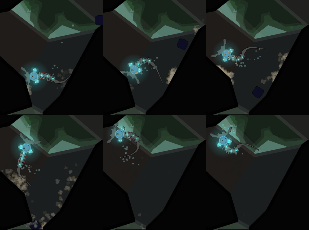
So I rolled up my sleeves, ignored all of that, and added a particle engine + basic lighting effects!
Gotta do something for fun.
Oh! Also, I’m going to the Games for Change festival in NYC at the end of July! There’s this meetup before the festival where the organizers were trying to get neuroscientists to meet game designers to make educational games -- my exact cup of tea basically made-to-order.
WHAT’S MORE, they’re gonna be giving me free admission to the festival and I’m going to be able to crash with friends in the city, so the whole thing isn’t going to break my bank account. So that’s nice.
Design Corner
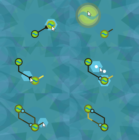
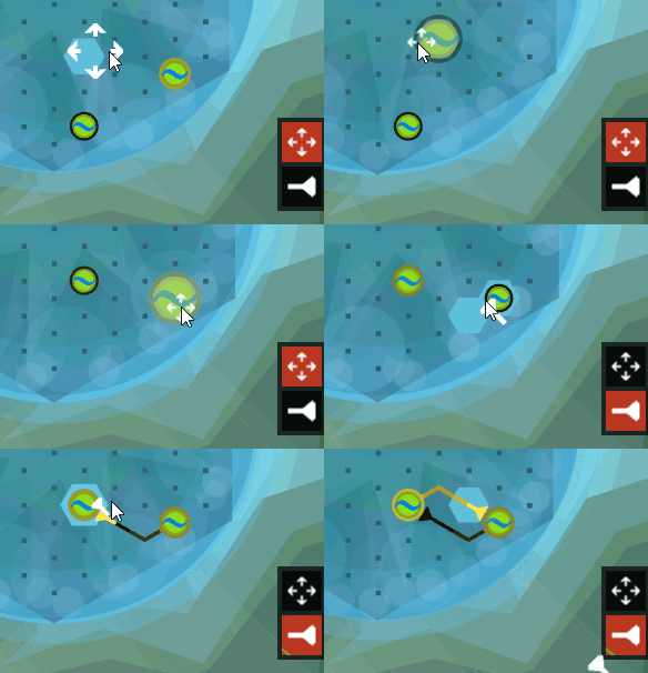
I’ve been struggling with one basic thing in the brain: how to move cells versus drag connections. The simplest answer was to add in some kind of move / connect toolbar, but I wanted to see if I could avoid adding more menu buttons.
My first attempt: double-click to pick something up, click+drag to connect.
It sounds simple, and if you know what you’re doing, it’s very efficient. However, in testing, it was one of the most consistent stumbling blocks for people. They’d pick up a cell when they meant to connect it, and accidentally make a whole bunch of connections when they wanted to move it.
I tried a few more variations on this (e.g. left-click-and-drag to connect, right-click-and-drag to move) but people still had a hard time remembering how to do what.
So I gave in and added a toolbar.
The lesson I’m taking away from this is that, as far as accessible design is concerned, invisible functionality is not functionality. It doesn’t matter how efficient or elegant something is in the abstract. Your audience will be frustrated if things don’t work they, with all their cultural baggage and expectations, can’t figure it out.
Since one of Crescent Loom’s design pillars is accessibility, I’m making the sacrifice of something that’s slightly more efficient in favor of something people can actually use.
Tweening
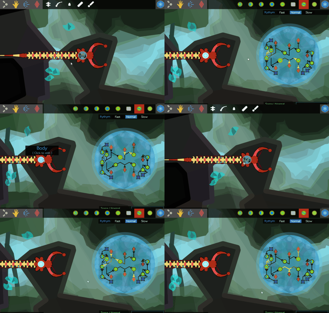
Another not-tutorial thing I spent a day or two working on was adding some basic tweening to the camera. Tweening is a term borrowed from animation that refers to the “in-between” frames when something moves from one position to another.
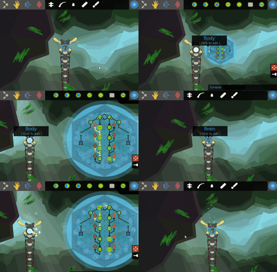
Here’s what it looked like to open up the brain in the old version:
And here’s what that looks like tweened:
Tweening is one of those magical secret-sauce-game-design-techniques that isn’t very hard to do, but makes things feel super A+ polished. If you’re into this sort of thing, there’s a foundational talk that spills the rest of game designer’s secrets here.


