Wicklog #3 - Menus for daaaays
Oof, it’s already been a month since the Kickstater ended? Time is flying by, it feels like I barely get anything done each individual day, but looking back I'm always surprised by how much I did.
Quick note: I’ll be showing Crescent Loom at Betacon in Portland this weekend! (Apr 15-16) If you wanna see how the game’s coming along, that’ll the place to say hi!
Changes for this week:
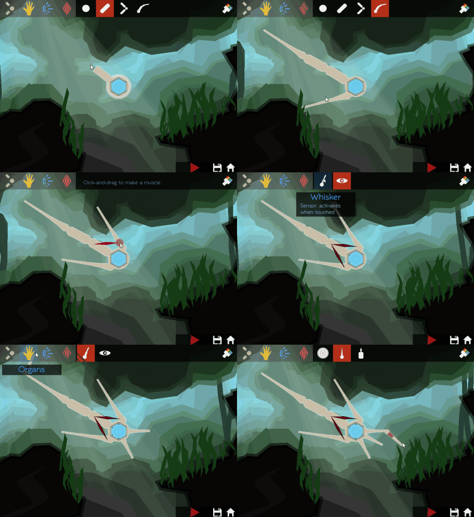
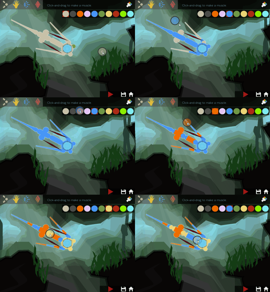
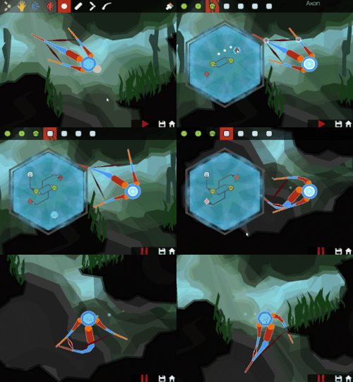
The biggest visual difference is that I finally added a user interface! You can now click buttons instead of having to tab through a thousand different options:
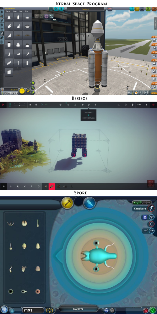
I looked at a handful of other construction games as reference points. I think it’s pretty obvious which one of these I stole the most from:
Kerbal Space Program suffers from presenting too much information (its pop-ups are a mess) and Spore suffers from being simple to the point of uninteresting (though it is cute & approachable, which is important).I tried to strike the same balance as Besiege, and limited icons to horizontal bars on the top and bottoms of the screen. If more needs to be shown, I can do that in a pop-up when people mouseover or click the icon.
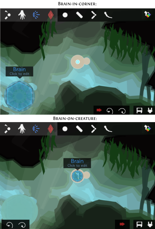
The most interesting design decision was how to incorporate the brain window. I didn’t want a separate half of the screen anymore, so I figured to go for a picture-in-picture approach.
Two options presented themselves to me:
-
Put it in the corner, like a minimap. You can see what’s going on in the brain, but it doesn’t dominate the screen.
-
Put it on the creature itself. This was cool because it shows that the brain is really just another part of the body, but I’d be forced to shrink it down so much that it was a lot less legible.
(In either case, clicking on the brain would embiggen it to take up half the screen.)I asked Twitter, and people were pretty enthusiastic about putting it on the creature itself, so that’s what I did. I might set the other mode as an option, because I think there are cases when you’d want to clearly see what’s happening without it taking up most of the screen. Something for Future Wick to do.
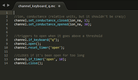
Turned out that simulating the ion channels opening and closing along each neuronal tile in a scripting language (which is more flexible than the main “engine” code, but slower) was too computationally intensive, so I simplified the ion channel scripts to only run once during setup. Here's the ion channel that responds to a keyboard hit. Any cell with this becomes thirty times more permeable to sodium while the Q key is pressed:
Finally, there was a bunch of backend stuff I finished up doing as a consequence of the new way I’m simulating neurons. The easiest way of saving all the neurons + ion channels was actually save these ion channel scripts in the save file and running them on loading the creature.
P.S.
Ugh, why do I reinvent the wheel every time I make a new user interface. TBH, most of my week was ironing out the logic of how menus and icons arrange themselves. NOTE TO FUTURE WICK: text wrapping has been solved a thousand times. If you find yourself trying to do it again, don’t. Use a library that doesn’t have all the bugs your sleep-deprived brain decided would be fun to add.


